Inform Redesign from Design Principles
Design Principles are foundational values that help frame design decisions. When facing increasing amount of complex clinical data and new partnerships, my design team struggled to just “squeeze” new content and features on the existing frame. Through some fun workshops and cross-functional feedback sessions, we established clear values to guide our design decisions for the new era.
My responsibilities
Spearheading the effort to create Design Principles with the designers on my team via interactive workshops.
Building alignment with cross-functional stakeholders, showing the value of this exercise and coaching them how to critique design with these design principles.
Guiding, critiquing, suggesting new design patterns to eventually signing off on all design decisions throughout this process.
Challenges
Stakeholders on my team were not familiar with the idea of design principles, getting their buy-in required lots of 1:1 sessions and demonstration of value. More importantly, as the tool became more complex, they had yet flexed the muscle to make tough trade-off decisions. On the other hand, my design team was feeling overwhelmed with the flood of new requests from partnerships and multiple feature backlogs. While they had varying degree of familiarity with Design Principles, they questioned the ROI of such time investment during crunch time. However, I saw the expanded team struggle to collaborate with one another; we were accumulating product design debt with each subpar feature addition. Something had to be done!
Design Principle Working Sessions:
Identify the core value mix
During one of my company wide all-hands, I gathered my team in person to confront the identity crisis of our product. What does Flatiron Assist’s (FA) target audience desire from the tool? Who is FA if it was a person? What are the main characteristics/attributes?
A brand’s personality is a set of human traits that represent the product’s value and attributes. The 12 brand archetypes guided our thinking initially without making each designer feel defensive.
After setting the stage and explaining the WHY, I introduced the brand archetypes wheel to the team. Very quickly, a few themes emerged from the brand personality.
Two brand personalities stood out the most: The Caregiver as the primary, and the Sage as the secondary. The votes were almost unanimous. The next step was about merging the two groups of attributes to identify specific intersections where our foundational values can be best articulated.
2. Articulate Enterprise Software Design Process
For the second session, we talked about how designing enterprise software is different than designing for consumer applications. How does the design process differ? What are the unique considerations? We summarized three aspects that make our design process different:
a. Embrace modularity. Design everything with a view that it is meant to evolve and grow. Instead of just concentrating on creating tailored components for the current need, lay equal emphasis on making them adaptable and scalable to future needs.
b. Establish order and process. Excellent collaboration, solid customer research, actionable problem statements, focused design iterations are often expected, but it’s very hard to achieve them all each and every time. Your best bet is to set up a repeatable process and make improvements to it with each cycle.
c. Think holistically. Always be aware of how your designs and additions are affecting the overall product and the company’s vision. Having a holistic approach to everything you build, add or upgrade, will automatically lead to a coherent & consistent product experience.
3. Collect examples of Design Principles
For the third session, I asked my team to find inspirations from other products and companies. The problem we were facing was not unique, how might we best express the values to guide design decisions? How might we build cross-functional alignment with team stakeholders? What are the examples we can model after?
Design principles are essential articulations of guiding considerations that will help the team make important decisions along their journey and reflect the team's vision and values.Good design principles are written as a teamGood design principles are memorable.Good design principles help you say no.Good design principles are broadly applicable.
4. Mind-mapping of our users’ expectations
For the fourth activity, we brainstormed individually and collectively on our customer’s expectations. This was not a feature backlog but the values that resonated based on numerous user interviews and design feedback sessions. What does it mean for FA to be TRUSTWORTHY, INTELLIGENT & PROGRESSIVE?
5. Develop the Design Principle Themes
After massive divergent thinking, we needed to converge on basic themes from the previous activities. Each designer on my team took part to translate the mindmapping exercise into values on sticky notes. We then grouped the stickies, identified the core themes and discussed the relationships among one another.
6. Synthesize the findings to create Design Principles
There is clear benefit to brainstorm with a large group of participants; the process of synthesizing and distilling information is quite the opposite because we wanted to come up with language that are crisp, pithy and memorable. I collaborated with a junior designer on my team to bring this process to the finish line. I also held sessions with various cross-functional stakeholders to introduce the concept and the process individually in order to build internal buy-in before socializing with the larger team .
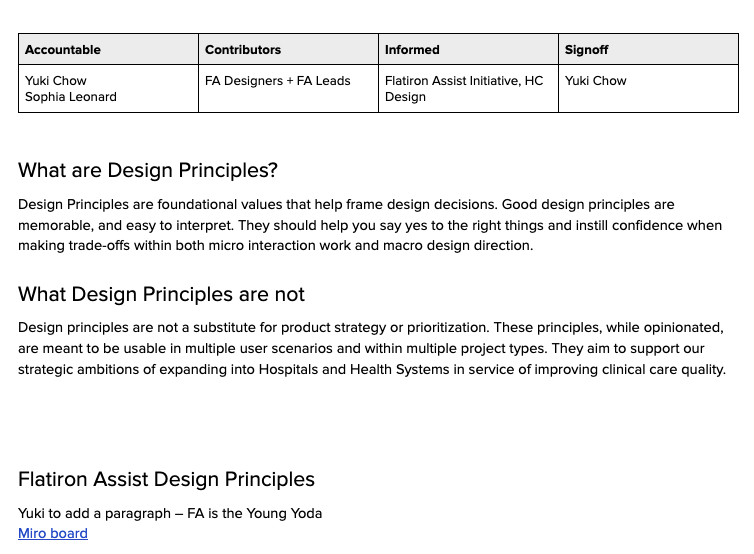
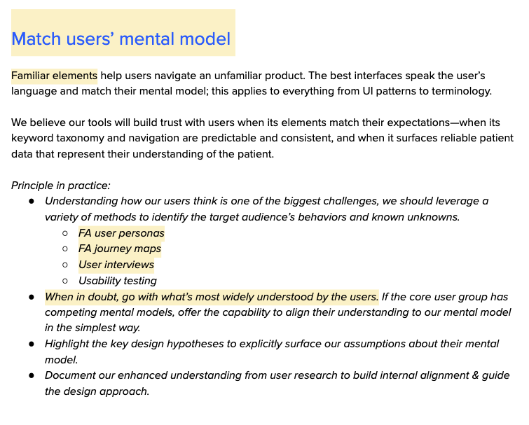
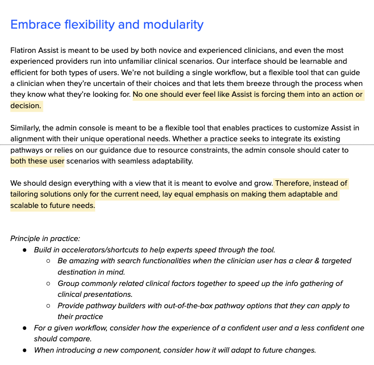
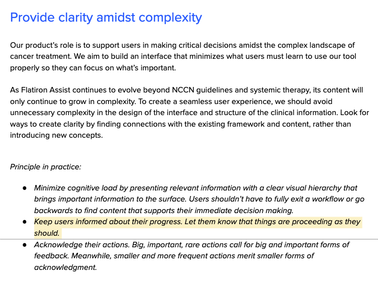
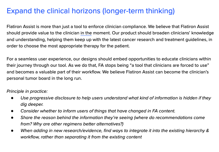
Food for thought: one of the loudest pieces of feedback from my cross-functional partners was the need to guide them tactically during design critique sessions. I realized knowing the values cannot necessarily accelerate decision making for the whole group. We decided to include the Principle In Practice section under each Design Principle, and separately, we conducted function-based alignment + Q&A sessions where I broke down the WHY, WHERE & SO WHAT to establish a shared understanding both strategically and tactically.
Examples of FA Redesigns in Support of the Design Principles
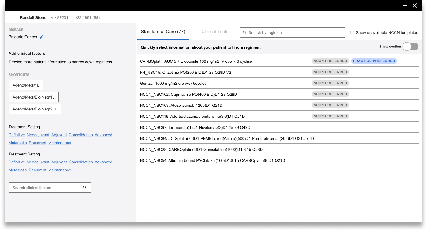
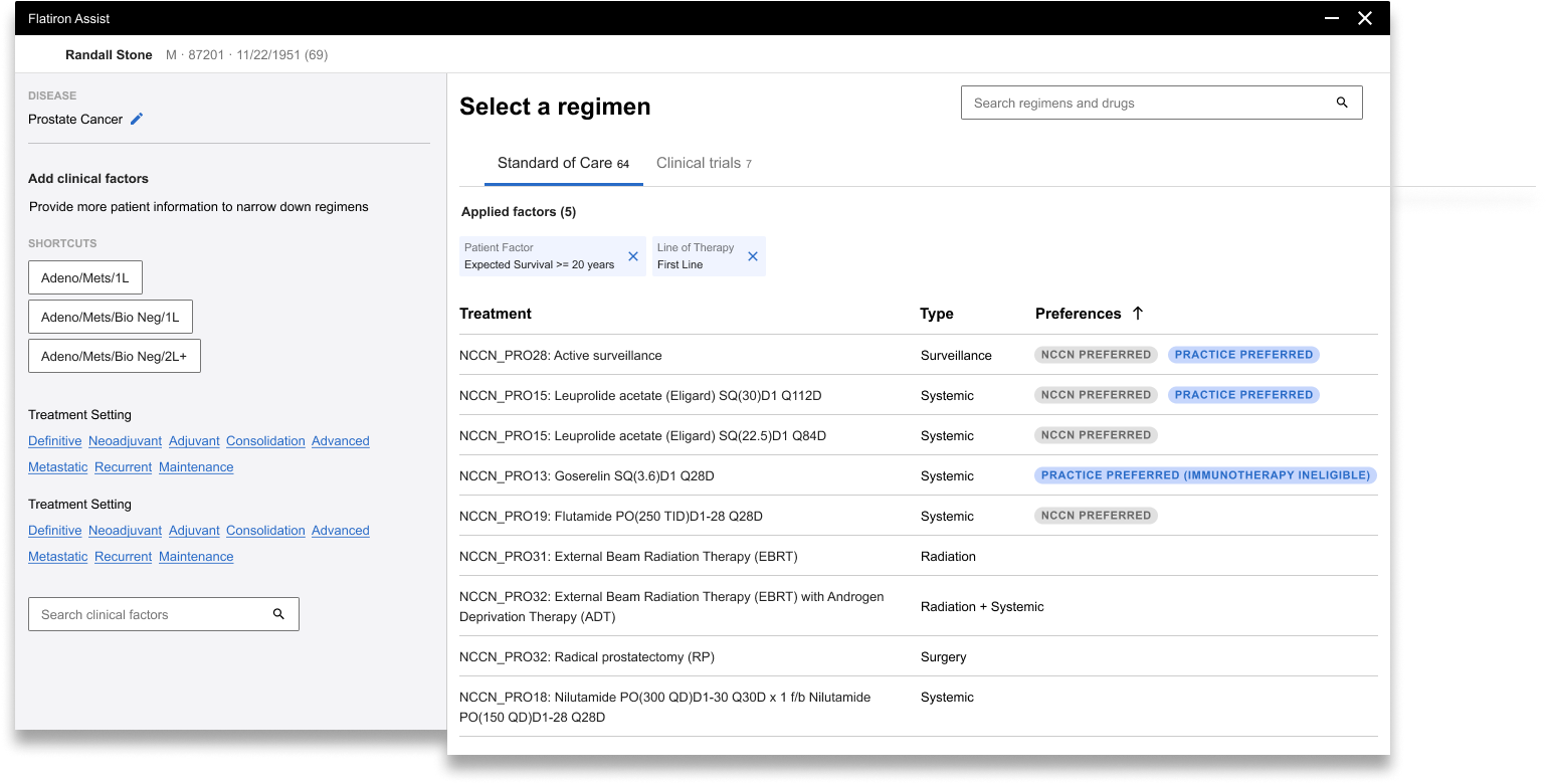
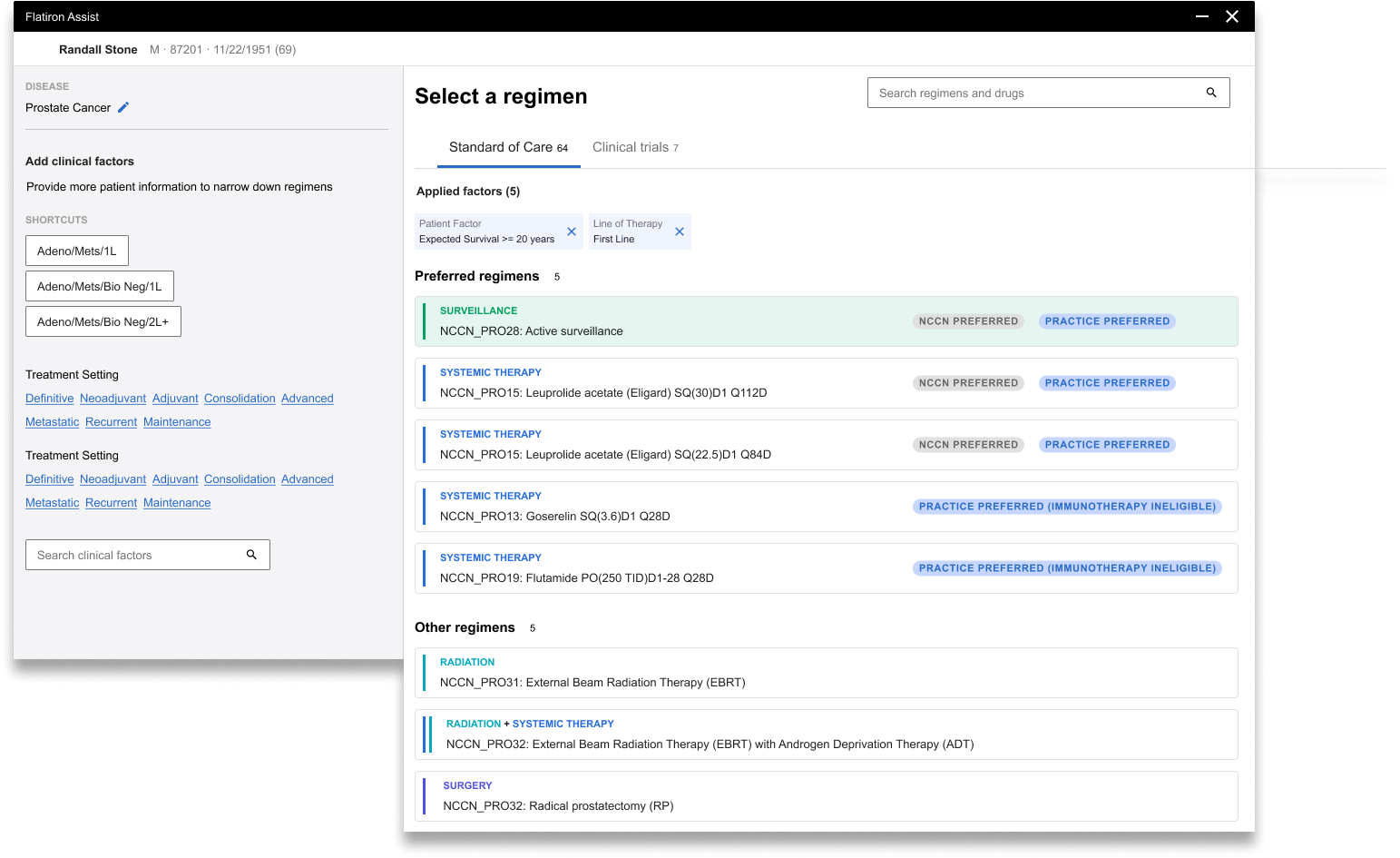
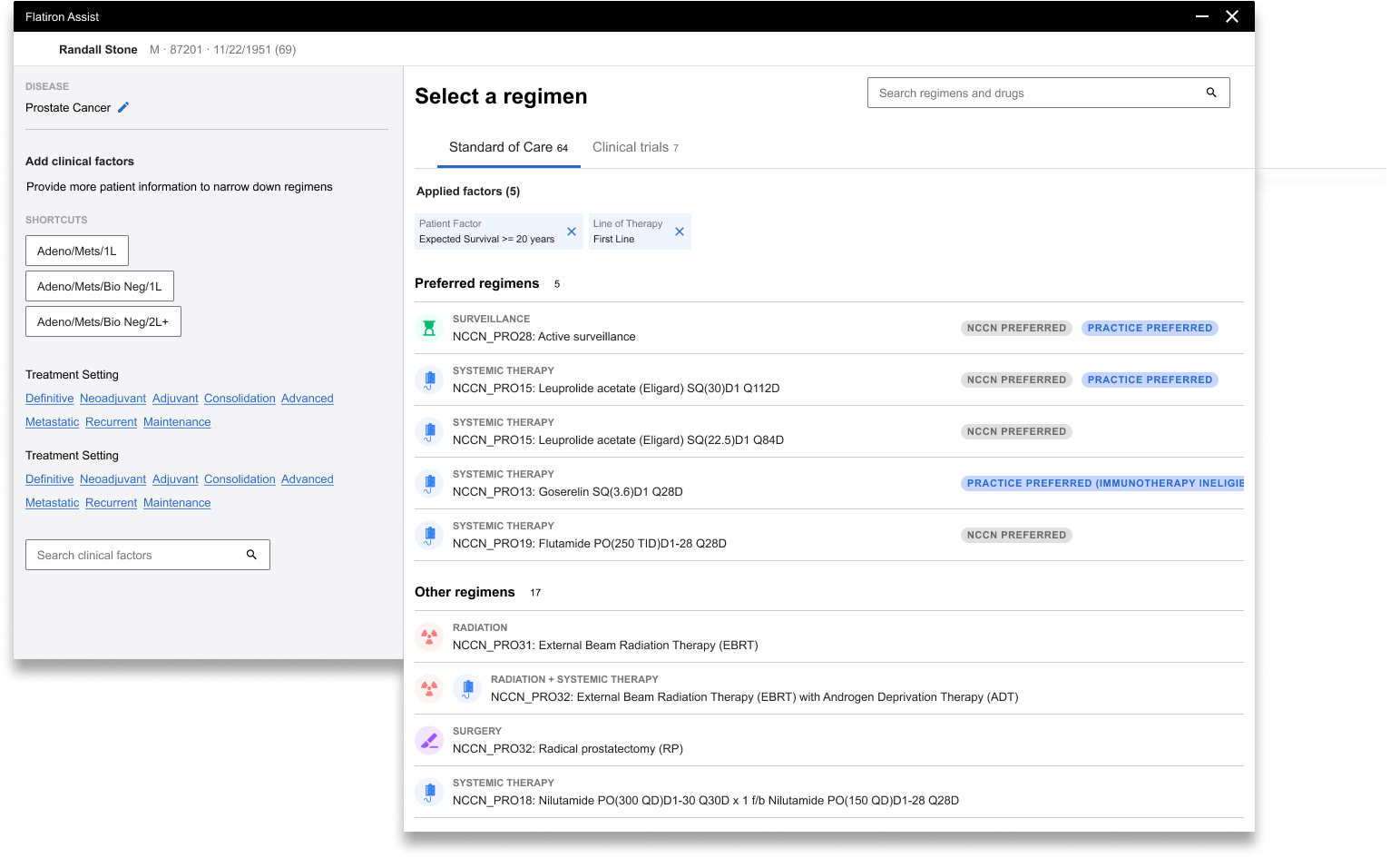
Provide clarity amidst complexity
As Flatiron Assist continued to evolve beyond NCCN guidelines and systemic therapy, its content would only continue to grow in complexity. We had to figure out how to minimize cognitive load by presenting relevant information with a clear visual hierarchy in order to bring important information to the surface.
Match users’ mental model
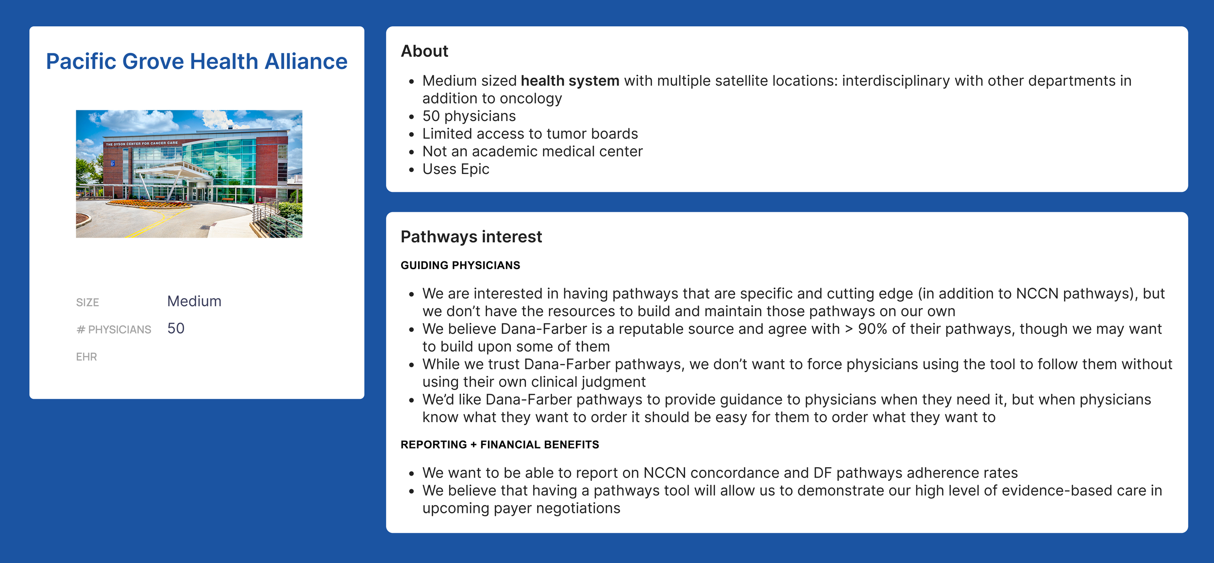
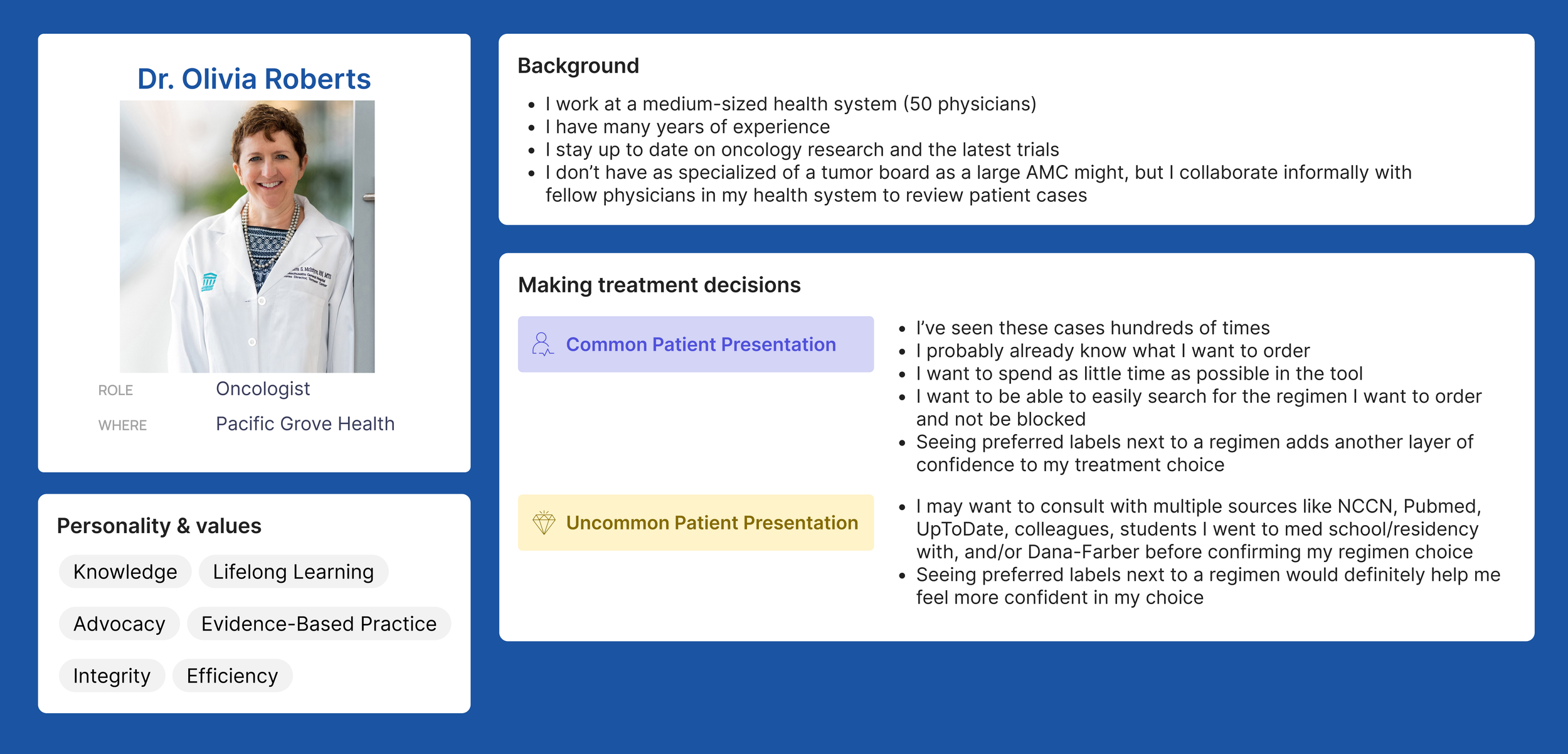
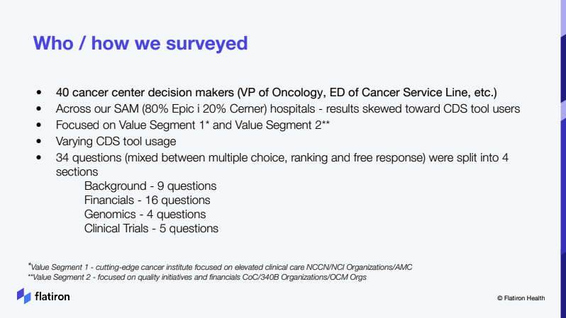
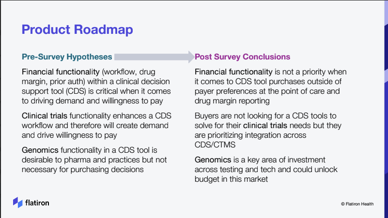
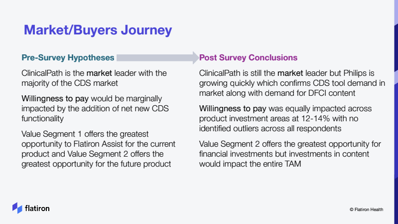
This principle resonated with so many team members and stakeholders, because we all felt our product had gradually lost its user-centricity. We believe familiar elements help users navigate an unfamiliar product. The best interfaces speak the users’s language and match their mental model. While the design team has always been at the forefront of user research and user interviews, we didn’t spend sufficient time sharing and considering our customer’s mental model in our decision making. Subsequently, we put together a variety of artifacts to highlight our target audience’s behaviors and known unknowns, such as personas, journey maps, usability testing results. More importantly, I got directly involved in our marketing and sales effort to help launch a buyer survey, which directly impacted our product roadmap for the next 6-9 months.
Embrace flexibility and modularity
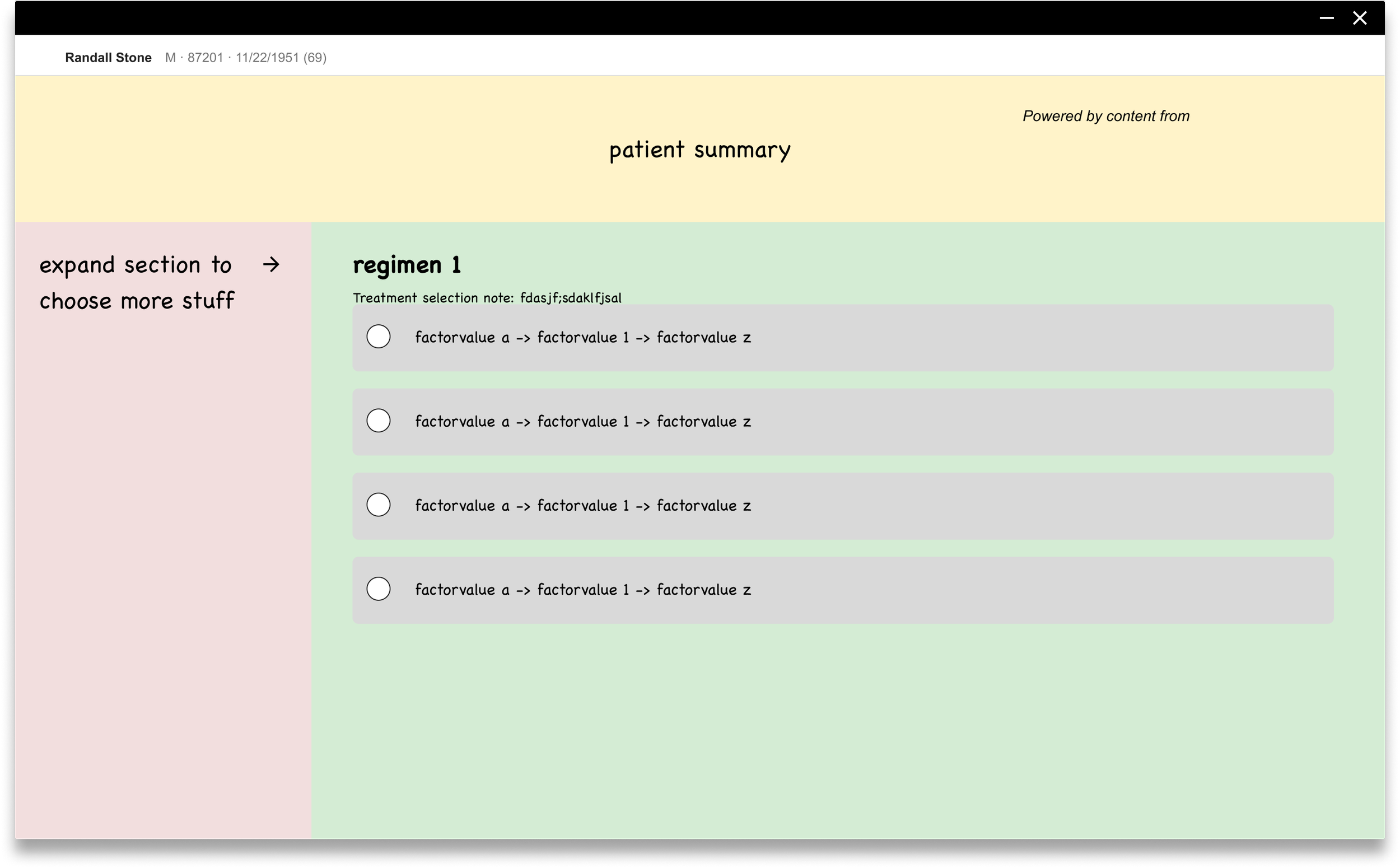
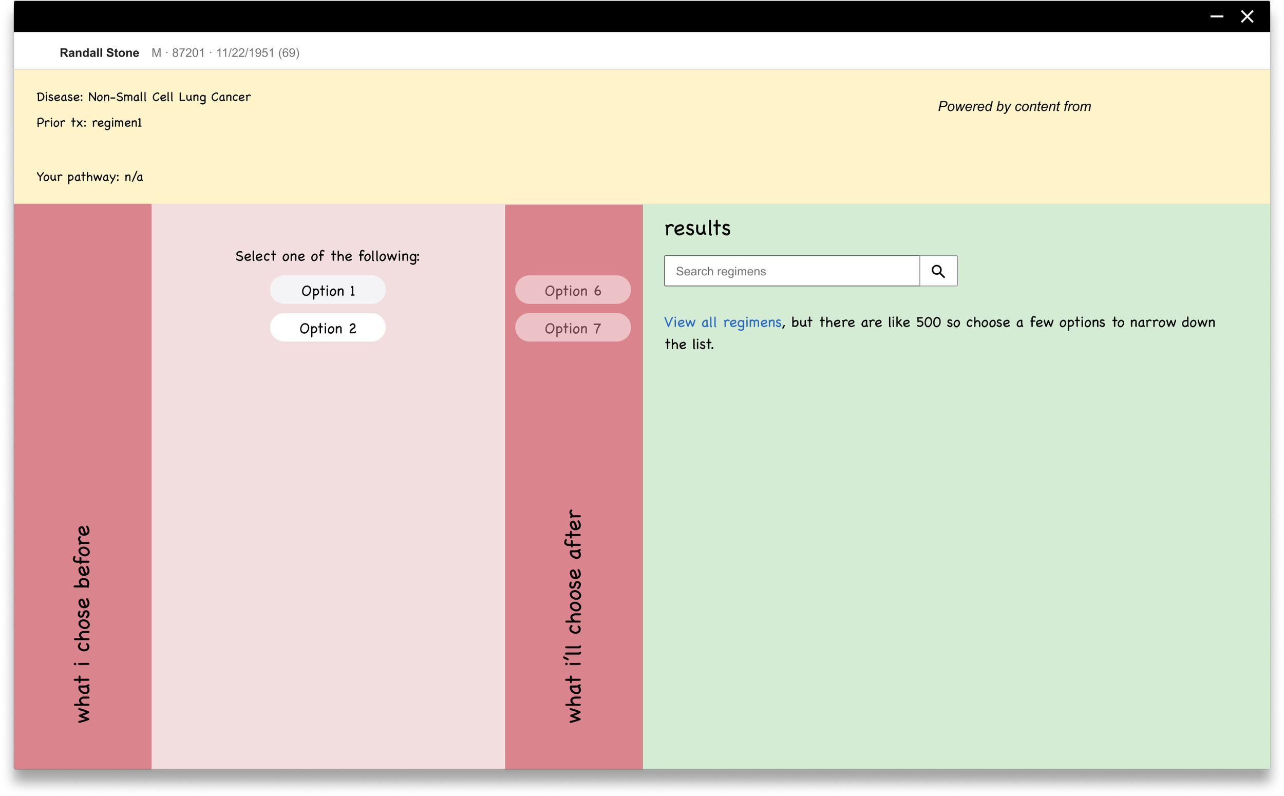
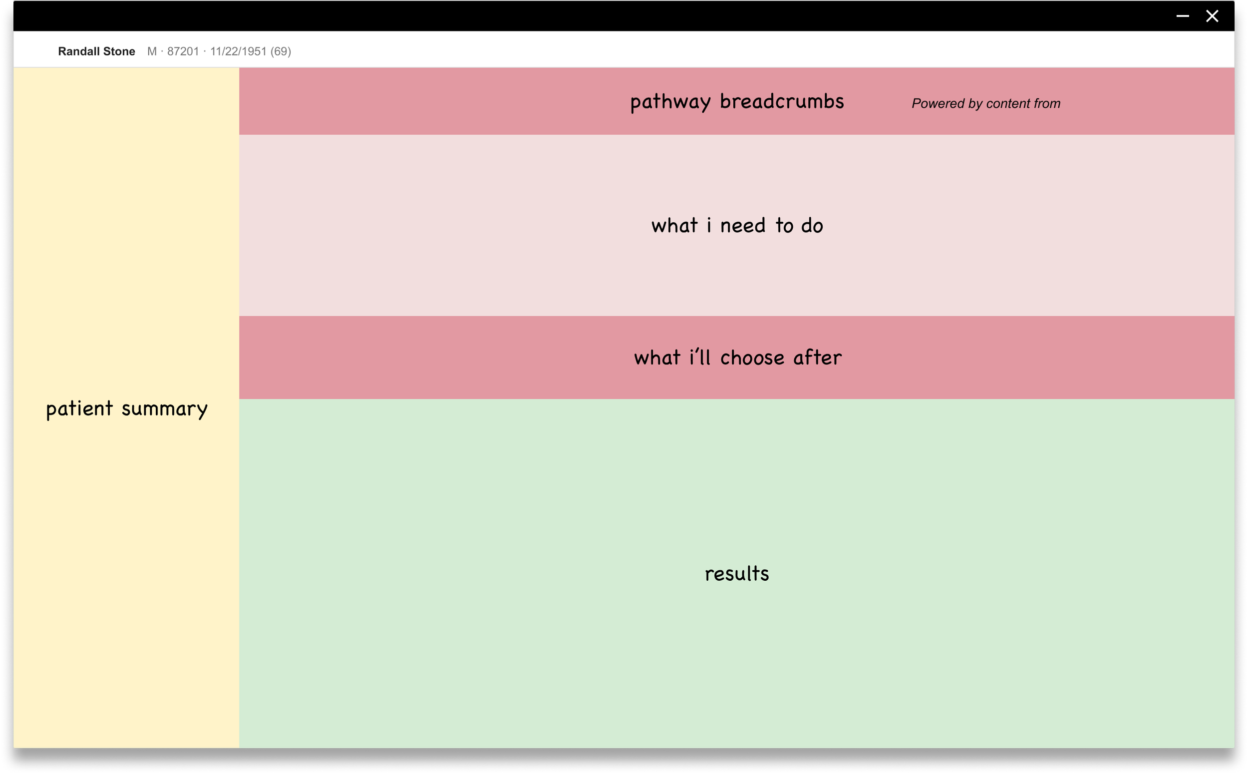
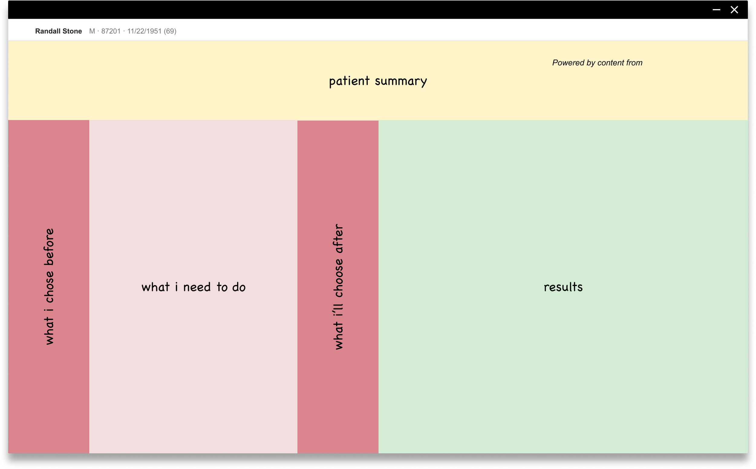
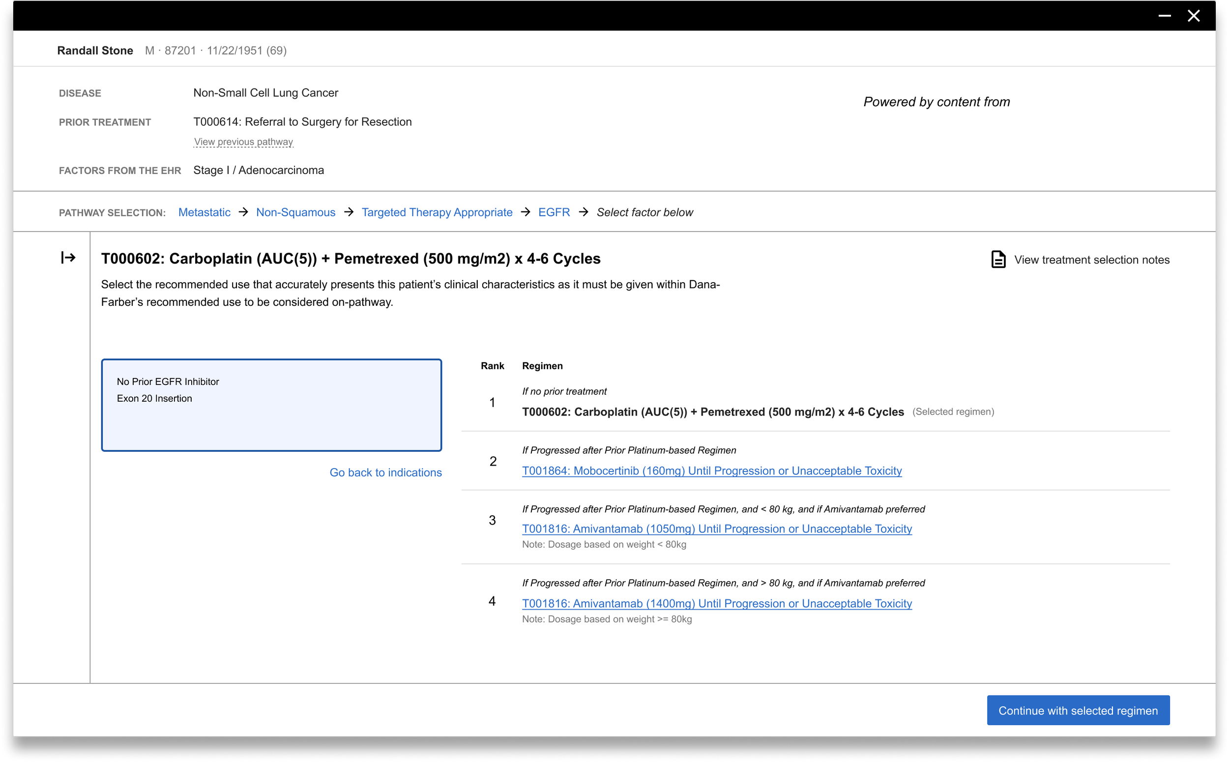
We believe no one should ever feel like Assist is forcing them into an action or decision. Flatiron Assist is meant to be used by both novice and experienced clinicians, and even the most experienced providers run into unfamiliar clinical scenarios. Our interface should be learnable and efficient for both types of users. That wasn’t the case before the redesign, experienced doctors found the tool to cumbersome to use. In order to build a more scalable solution, especially in the wake of the content partnership with Dana Faber, I asked my team to re-imagine the information architecture of the application. How might we enable the experienced users to “escape” the pathway flow when they know what they want to order? How might we support physicians when they need to order the regimen off-pathway? We formed a SWOT team to explore various possibilities.
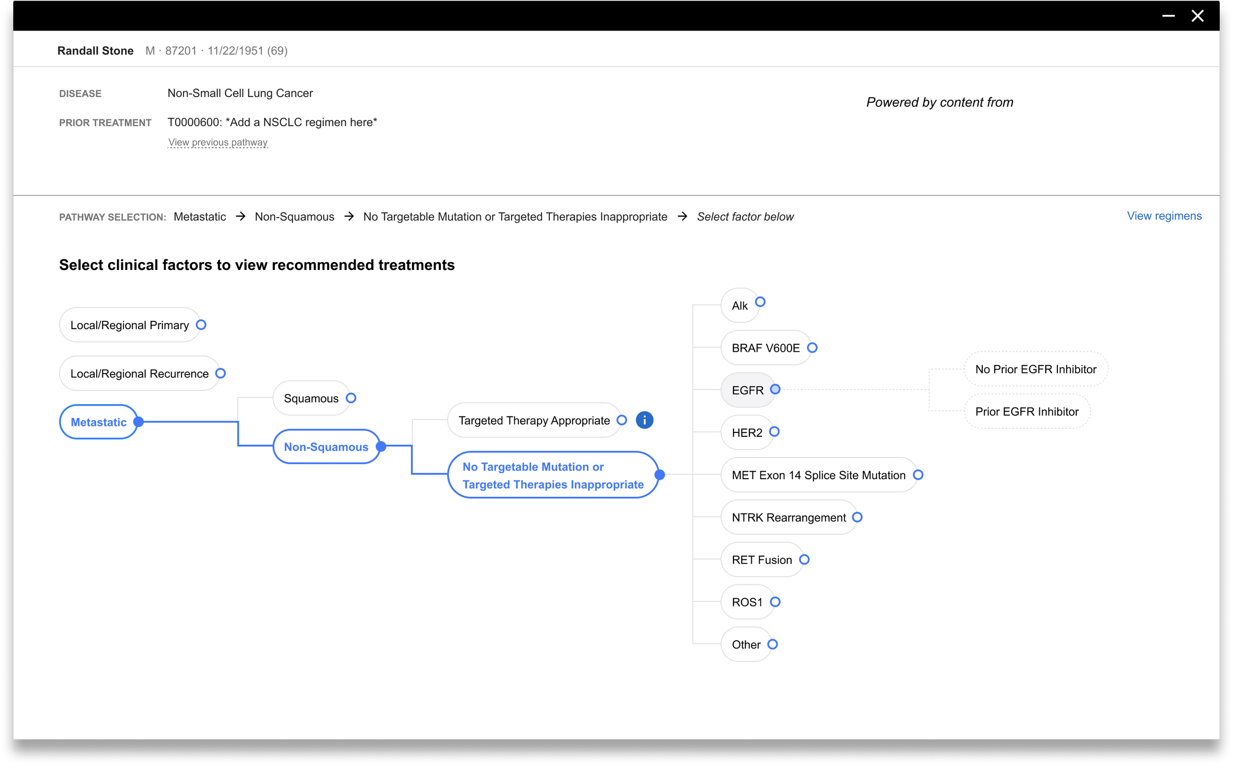
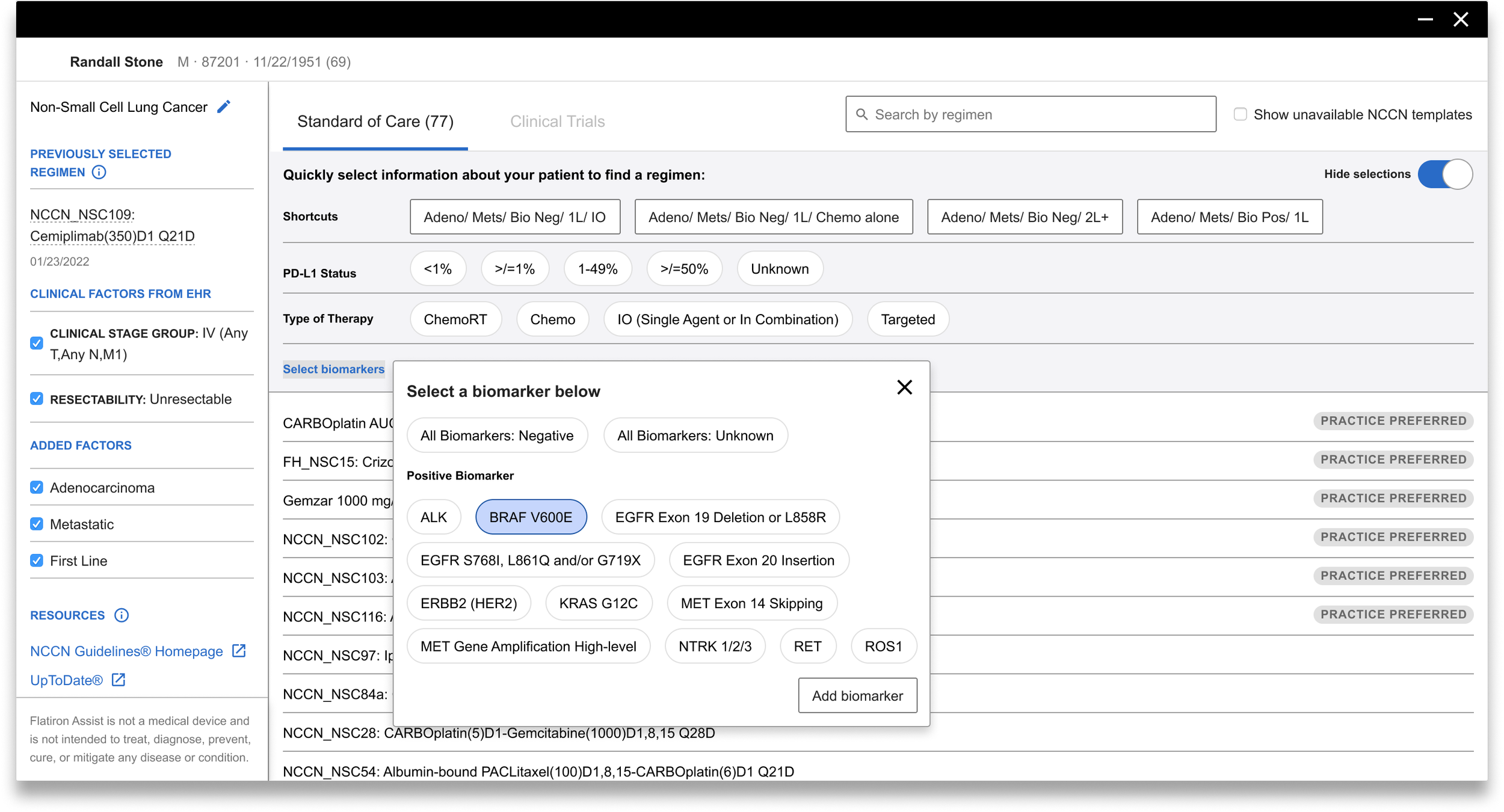
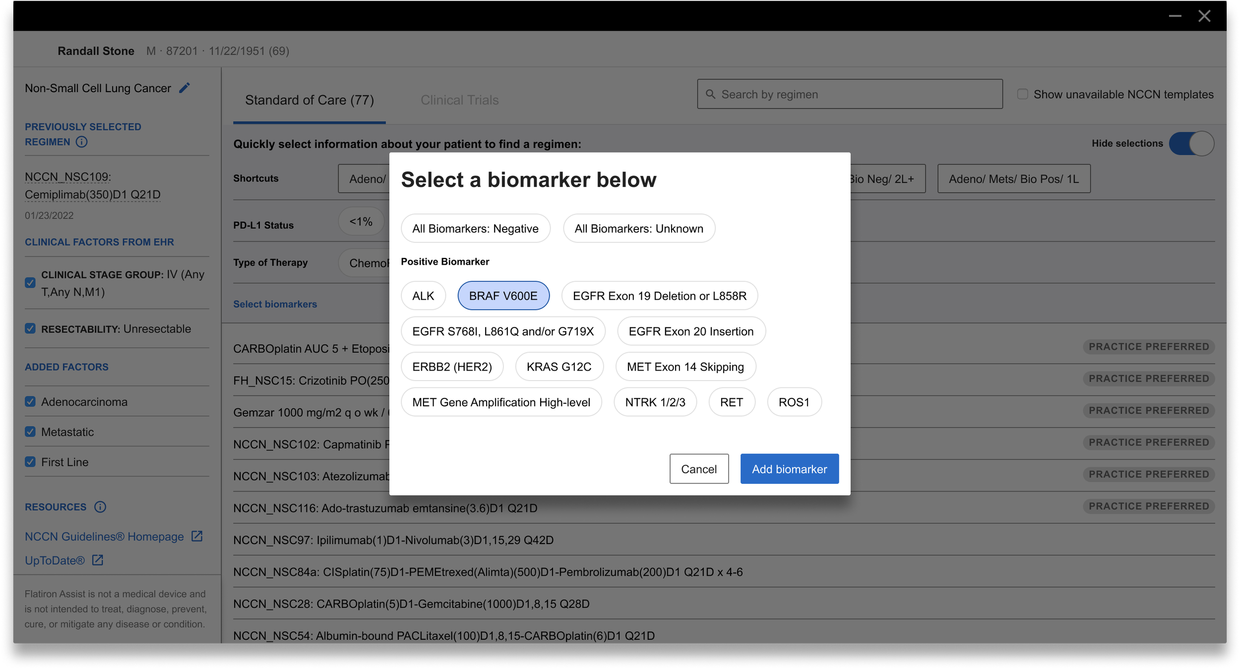
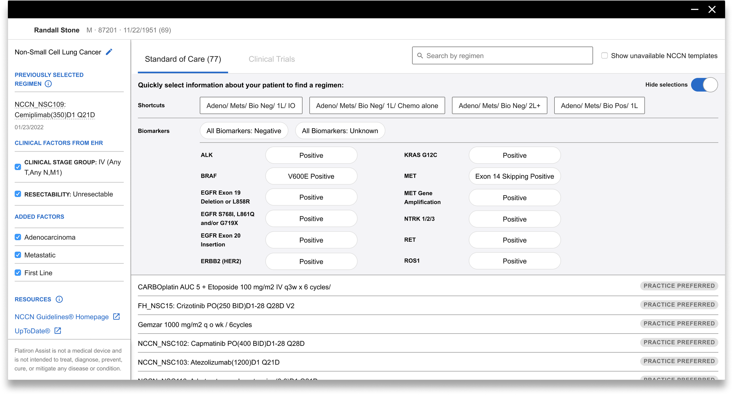
Expand the clinical horizons (longer-term thinking)
For a seamless user experience, we believe our designs should embed opportunities to educate clinicians within their journey through our tool. We believe Flatiron Assist can become the clinician’s personal tumor board in the long run. Those ideas sparkled new concepts, those concepts led to more clarifications of our long-term product strategies, those strategies later became part of our living and evolving “North Star!”
